Reading Time: < 1 minute
When you are building dashboards in any BI or Analytics tool, the design of the dashboard is usually a challenge that has to be solved each and every time. While each dashboard’s needs are different, I thought it would be great to always start off with a design that can help with telling the story of the data elements and metrics to be showcased.
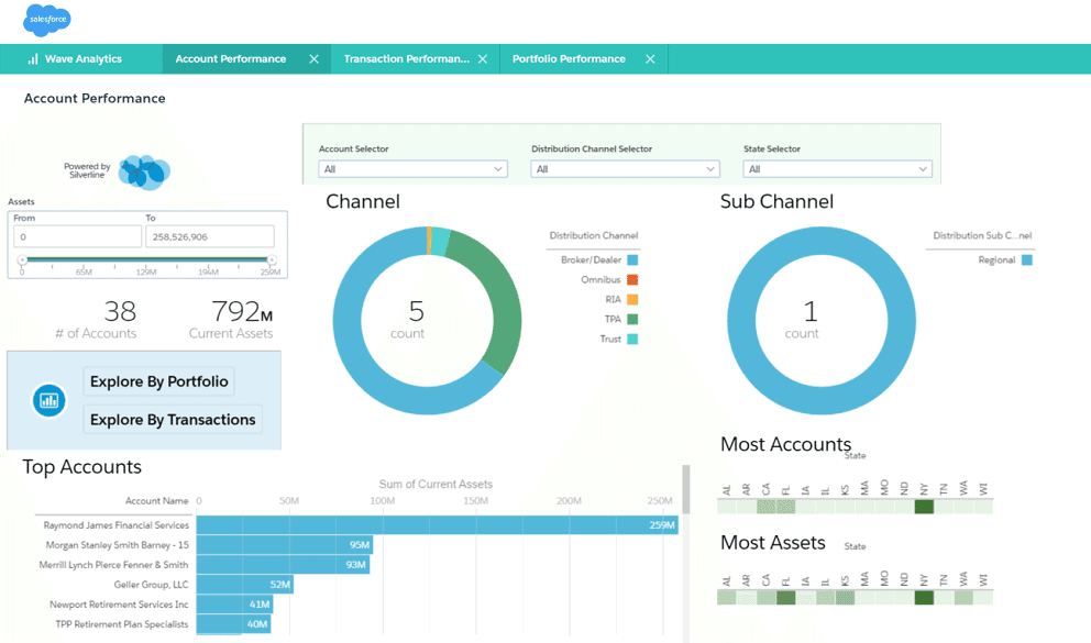
With Salesforce Wave Analytics, you can easily use a pre-built template to get you started down that path of a standard look and feel. I released a Salesforce Wave Template that can be used by Wave’s Dashboard Templater.
This will get you started quicker with a dashboard that has a predefined section for:
- Your logo
- Filters
- KPIs
- A dedicated section to engage in analysis
- A dedicated section to showcase metrics
- A dedicated section to highlight metrics
- A dedicated section to place trends
- A data explorer section to view raw data
You can just change the colors of the boxes currently defined and have it branded in the style that you want.
Instructions on how to use can be found here https://github.com/gneo54/wavetemplates
This repo was inspired by https://github.com/timothy-law/templates
This blog originally appeared on SF for You, a blog by Silverline Technical Architect Gean Martinez.


