Adding Custom Tabs and Buttons to the Details Popup | LWC
If your business has requirements that go beyond our out-of-the-box features, reach out - we offer custom development services for CalendarAnything to meet your unique needs.
Custom tabs and custom buttons can be configured on the CalendarAnything Details popup. Custom tabs execute Flows that were created using Salesforce Flow Builder. Custom buttons allow users to navigate to external URLs, start a flow, open a lightning component, or navigate to a related record.
In this article:
Related Demo:
Customizing the Details Popup
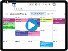
This image shows an example of the Details Popup configuration step of the Create and Edit Calendar wizard.

How to add a custom tab to the Details Popup
Flows can update Salesforce data. Consult your system administrator if you are not familiar with Flows in general or with the particular Flow you want to use.
To add a custom tab to a calendar Details Popup, follow these steps:
- Right-click the calendar name on the sidebar and select Edit.
- Select Details Popup from the Edit Custom Calendar menu. The Details popup edit page appears.
- On the Details Popup configuration step, expand the Custom Tabs section.

- Click Add. The Set Custom Tab popup appears.

- Enter a Label for the flow. The application populates the API Name.
- If you have an ID variable, enter the ID Variable Name.
- If the flow uses other variables, configure them using JSON in the Variables section.
- On the Edit Custom Calendar menu, select Calendar Criteria. The Calendar Criteria page appears.
- Expand the Advanced section.
- Select Flow from the Create Form drop-down list.
- On the Edit Custom Calendar menu, select the Create and Edit Popup.
- Define which flow should be used by providing the flow API name and variable names for start and end date/time input parameters. If flow is used to edit or delete records, there are sections to specify which flow should be used.
How to add custom buttons to the Details Popup
To add a custom button to a calendar Details Popup, follow these steps:
- Right-click the calendar name on the sidebar and select Edit.
- Select Details Popup from the Edit Custom Calendar menu. The Details popup edit page appears.
- On the Details Popup configuration page, expand the Custom Buttons section.

- Click Add. The Select Custom Button Type popup appears.

- From the field dropdown, select the type of functionality you want the button to execute. Options include:
- Open Flow in Popup: Executes a specified Salesforce Flow
- Open Component in Popup: Opens specified Lightning component in a popup
- Navigate to Component: Redirects user to specified Lightning component
- Navigate to URL: Redirects user to specified URL
- Open URL: Opens specified URL in a new tab
- Click OK. The Set Custom Button popup appears. Note: Fields vary based on selected button type.
- Use the popup to configure the button. Refer to Configuration fields by button type for field help.
- Click OK. The application returns to the Details Popup step.
- Click Save.
Configuration fields by button type
Click Edit on the row with the button type to be edited. Follow the appropriate button type instructions below.
- Open Flow in Popup
- Label: Text to appear on the custom button.
- Icon: Icon Name from the utility: https://www.lightningdesignsystem.com/icons/.
- Show Label: True or False (Can only be False if there is an icon).
- Active: Whether this button should be active.
- Flow API Name: Name of the flow API. (Find Flows by entering Flows in Salesforce Setup Quick Find field.)
- ID Variable Name: Name of the variable that contains a record ID, if there is one.
- Variables (JSON): Area to enter flow variables in JSON format.
- Width: Width of the popup.
- Height: Height of the popup.
- Open Component in Popup:
- Label: Text to appear on the custom button.
- Icon: Icon Name from the utility: https://www.lightningdesignsystem.com/icons/.
- Show Label: True or False (Can only be False if there is an icon).
- Component API Name: Name of the component API. Format as c: + Component API Name. Example, c:RD_Toast_Message.
- Parameters (JSON): Area to enter component parameters in JSON format.
- Width: Width of the popup.
- Height: Height of the popup.
- Navigate to Component:
- Label: Text to appear on the custom button.
- Icon: Icon Name from the utility: https://www.lightningdesignsystem.com/icons/.
- Show Label: True or False (Can only be False if there is an icon).
- Active: Whether this button should be active.
- Component API Name: Name of the component API. Format as c: + Component API Name. Example, c:RD_Toast_Message.
Note: Component must contain: implements=”lightning:isUrlAddressable” to use this button type. - Parameters (JSON): Area to enter component parameters in JSON format.
- Navigate to URL:
- Label: Text to appear on the custom button.
- Icon: Icon Name from the utility: https://www.lightningdesignsystem.com/icons/.
- Show Label: True or False (Can only be False if there is an icon).
- Active: Whether this button should be active.
- URL: Specific URL to which the application will automatically navigate. Example: https://calwcqa.lightning.force.com. If specifying Replacement Field, you must add /[id] to your URL. Example: https://calwcqa.lightning.force.com/[id]
- Replacement Field Name: Record ID that will replace /[id] in URL if navigating to a Salesforce URL with id.
Example: account__c
Note: This applies to Salesforce URLs only. The application performs a lookup from the Event Details Popup to do the replacement.
- Open URL:
- Label: Text to appear on the custom button.
- Icon: Icon Name from the utility: https://www.lightningdesignsystem.com/icons/.
- Show Label: True or False (Can only be False if there is an icon).
- Active: Whether this button should be active.
- URL: Specified URL to be opened. Note: If specifying Replacement Field, you must add /[id] to your URL. Example: https://calwcqa.lightning.force.com/[id]
- Replacement Field Name: Record ID that will replace /[id] in URL if navigating to a Salesforce URL with id.
Example: account__c
Note: This applies to Salesforce URLs only. The application performs a lookup from the Event Details Popup to do the replacement.
Examples of configuration by button type
- Open Flow in Popup

- Open Component in Popup

- Navigate to Component

- Navigate to URL

- Open URL
