Reading Time: 4 minutes
As a UX designer, I’m always looking for points of reference, context, and analogy that will speak to my work. That’s why I keep a Zippo lighter on my desk.
In my mind, the Zippo lighter is the epitome of good design and one of the best examples I know of pure UX genius. It defines a standard to which all enterprise software should aspire and uses all four core Salesforce design principles.
Salesforce design principles 1 and 2: Clarity, consistency
It Just Works…

Courtesy of Salesforce
A Zippo lighter is designed to do one thing and do that one thing very well 一 light a flame which will stay lit, every time, in all kinds of weather. It is almost impossible to be confused by this directive. A Zippo conjures a nearly universal mental model of knowing that it doesn’t matter how windy, cold, wet, or dark the night, one can always have full confidence that their Zippo will light when needed.

Courtesy of Salesforce
Within the Salesforce ecosystem, the clarity and consistency of Salesforce Lightning Design System (SLDS) means repeatable success. This gives Silverline consultants the confidence to know that what we build for our customers will be a solution that works. What this means for our customers is solutions with components that they can expect to work the same way, every time, in every place.
For example, the SLDS global search function. It will always be persistent in the middle of the page header. It will always display my five most recent search records in a dropdown list when I click into the input field. It will always give me instant results when I begin to type. And it will always function this way in every Salesforce Org we stand up.
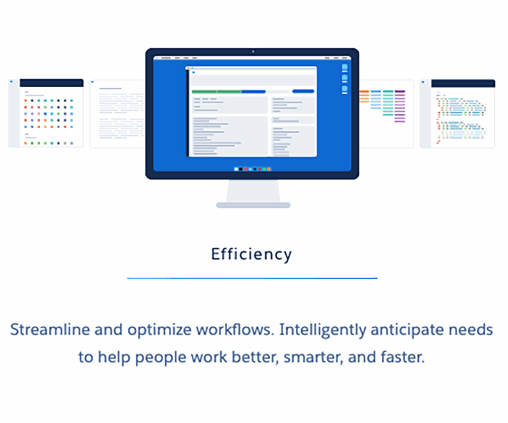
Salesforce design principle 3: Efficiency
It won’t break…
A Zippo is made out of smooth, stamped steel and has three moving parts. This is what makes a Zippo such a timeless design. It uses a simple mechanical flint wheel, which strikes a spark against a wick, which draws fuel from a dry reservoir. This dry reservoir is actually felt soaked in lighter fluid. Using wet felt instead of fluid makes it leak/flame proof. It can accidentally go through the wash and still light. It can accidentally go through the dryer… and not burn your house down. It can lie on a dashboard through a long Indiana summer without bursting or melting… and still light. One can back over it with the car and… it will still light.

Courtesy of Salesforce
Although certainly not indestructible, there is very little one can do to break a Zippo lighter. And if for some reason it does break, the robust simplicity of its design and materials makes it easy to fix with common household items. For example, cotton can be used in the fuel reservoir instead of felt. A wick can be made with a piece of string and some copper wire.
A Zippo is inexpensive to manufacture and accessible at any income level. It is equally at home lighting a welder’s torch as it is a boardroom cigar. We talk about the introduction of the desktop PC and the dissemination of information through the internet as significant contributors to the democratization of culture and the opening of closed societies… and they are. But the Zippo lighter has been a truly egalitarian device which has transcended socio-economic, religious, and cultural boundaries for the past 85 years.
The efficiency of SLDS is found in components which are built using the Single Responsibility Principle. This principle applies the Zippo’s “Do one thing and do it well” directive to code. This means developers can build components which are simple to maintain, reusable, and won’t break. Alternately, the egalitarian nature of SLDS means Salesforce admins have the ability to build solutions for their orgs without knowing any code at all using composable components which can be assembled into apps using “clicks not code.”
Salesforce design principle 4: Beauty
It is a delight to use…
Most flint lighters are pretty much designed to work the same way. What makes the Zippo such an iconic design, however, is the sheer pleasure it is to use. It has a nice weight and balance and feels good in your hand when you hold it 一 cold at first and then smooth and warm to the touch. It’s large enough to have substance, but small enough to keep in the pocket of your jeans.

Courtesy of Salesforce
The solid metallic click of the lid when it’s flipped open, the flinty scratch of the wheel, and the stringent smell of Ronsonol provide amazing sensory affordance and feedback. And to top it all off, it just looks right — with proportions that make it impervious to the trends of fashion. There is no mistaking a Zippo lighter for anything else. And there is no way to copy it without shameless plagiarism. With time and use, a Zippo becomes like a familiar old friend and, sometimes, an heirloom.
Design Systems are often mistaken as “visual libraries.” It’s true there is a huge visual element to a well-designed Design System, and Salesforce Lightning Design System (LDS) brings a visual elegance to enterprise software that makes applications beautiful. However, thinking of SLDS merely as a visual skin to make an app look “pretty” is like admiring a Zippo lighter and never ever opening it up and striking a flame. The real beauty of SLDS is how well it works and all the things we can build with it. Imagine if you will, SLDS providing our Salesforce customers with such a consistent, reliable, and delightful UX, it becomes as iconic and household a Design System as the Zippo is a lighter.
Interested in seeing how your org can improve its user experience? Contact us.


