“It’s a way for someone to be able to get access to promotion on all these different publishers that they essentially would have no other way to really be able to do,” said Alex McGeeney, Senior Director of Account Management at StackCommerce.
And they’re growing fast. StackCommerce needed a tool that could help them stay connected to their team and their customers as they grew — all in one place.
The challenge: one platform to coordinate hundreds of campaigns

StackCommerce quickly outgrew their existing process that ran on spreadsheets and a lot of luck. “There was no internal system for us to coordinate. When we first started, we were able to do that because we were working with only a handful of publishers and launching one or two products a week,” said McGeeney. “But over time, we started launching one to two products a day with more than 50 publishers. And it became clear that spreadsheets were not going to work for us. It wasn’t operationally efficient and we didn’t have the visibility we needed.”
With so many different partner types and products offered to their customers, they needed a tool that could coordinate it all. Because some clients use multiple products or media types, StackCommerce wanted to make sure they could see all of their customer information at-a-glance.
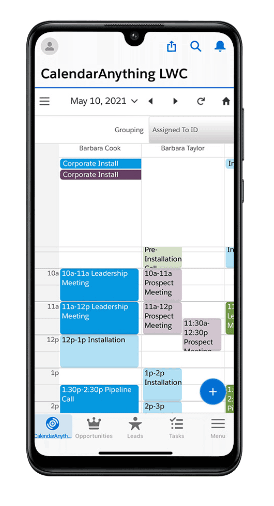
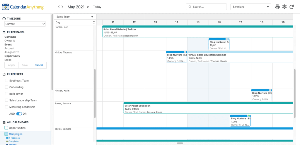
“We had to do so much lifting with manual setups for every different kind of opportunity,” he said. “Since we operate on a daily and weekly basis with each of our publishers, being able to track it in a calendar format makes a huge difference.”
That’s where CalendarAnything comes in.
What they really needed was one place to handle all of their campaigns. Whether executing for publishers or for their sales team, they needed a CRM that worked for them. CalendarAnything can do just that. Said McGeeney, “Salesforce was the obvious choice, and being able to build out a promotional calendar that lives in Salesforce gave us one place to access every promotion happening.”
A tool that integrates with multiple processes at once
With so many publishers and promotions to keep track of, StackCommerce needs CalendarAnything to plug into every part of their process, from ideation to performance analysis. By integrating performance data from Google Analytics directly into Salesforce, their teams always know when promotions are going live, how they’re doing, and when to make changes.
“We’re looking at performance data on these different articles in Salesforce, and we can go in there and see easily on the calendar whether an article is published or not and how it’s performing with the data we’re importing in,” said McGeeney. “We use different filters to recognize what’s published yesterday versus what’s going live tomorrow, and it’s super helpful.”
CalendarAnything also integrates into the other service they offer to customers: their content studio. They help clients create content in addition to promoting it. “For us to be able to build out a two-week calendar with our publisher and assign out 40-50 articles to a freelancer. That’s the key to scaling up our content production in a way that was impossible to manage before,” said McGeeney.

They can easily use CalendarAnything to coordinate with external stakeholders using the sharing features available. Admins can set visibility permissions, embed calendars into websites and social media for appointments, and make sure their freelancers and customers both get the information they need.
With CalendarAnything, you can create calendars from a custom Project object, then track and edit milestones directly on the calendar interface. CalendarAnything can overlay project management, case tracking, or resource assignment calendars in a holistic and color-coded view, so that projects stay on time, on track, and on budget.
“We built a bunch of different workflows,” said McGeeney. “We can see what we need to write about which product for which publisher on which date and assign it out to the content team. When the article is completed, they can mark it as completed and our team can move it forward to promotion.”
Flexible, customized calendars for the entire team
With CalendarAnything, the team doesn’t have to worry about making sure everything gets done on time — or whether every stakeholder can access the information they need. “It’s given us a lot of flexibility in terms of how we can customize the different fields we need. We have more than 200 different promotional calendars we’re using and we can coordinate it all in one place,” said McGeeney.
And they don’t need a Salesforce developer to do it. They can do it all with CalendarAnything.
“It’s something I can do, we don’t need a Salesforce expert to set up the calendars the way you want to use them. And I might use them differently than our production or merchandise team might,” said McGeeney. “It doesn’t have to be a one-size-fits-all solution for the whole company. We can make it whatever we want it to be and evolve it as we need to.”
CalendarAnything empowers StackCommerce to help their publishers tell their story, with a 360-degree-view of their entire operations. “My team uses it on a daily basis. We live in CalendarAnything,” said McGeeney. “We’re really happy with it.”


