Reading Time: 5 minutes
In 2016, a man named Guillermo Robles decided to order pizza from Domino’s. Despite his best efforts, his attempt was unsuccessful. Guillermo, a blind man, relied on screen reader software to navigate the web, and both Domino’s website and mobile app proved unusable and inaccessible with his assistive software.
He later sued Domino’s under the Americans with Disabilities Act (ADA), arguing that the Domino’s website ought to be accessible as a “place of public accommodation”, a phrase specifically used in Title III of the ADA.
His court case eventually found its way to the Supreme Court, who declined to hear it. This left the lower court’s ruling in place – they sided with Guillermo, arguing that public facing websites are in fact subject to the ADA and need to make reasonable accommodations for users with disabilities.
Guillermo’s case is just one of many in the murky gray waters of accessibility lawsuits. With more than 4,000 lawsuits against websites, apps, or video content filed in 2021, accessibility issues can be a legal liability. But looking past a purely legal argument, accessibility matters for a bigger reason: we don’t want to leave users behind.
In 2011, the WHO reported that over 15% of the world’s population live with some form of disability. If we hone in on the United States, the US Census Bureau estimated in 2014 that 27% (roughly 85 million) of the US population lived with some form of disability. As we create digital experiences, we have an obligation to ensure that all users can use them.
Today we’ll look at why accessibility matters and share some guidance on how to create accessible sites, experiences, and components on the Salesforce platform using custom Lightning Web Components (LWC).
Why accessibility matters
When one hears the word ‘accessibility,’ it is natural to connect it with another word: disability. This is a fairly understandable connection – take, for instance, the definition provided on the accessibility introductory page of the Worldwide Web Consortium (W3C):
“Web accessibility means that websites, tools, and technologies are designed and developed so that people with disabilities can use them.”
This definition is understandable and accurate, but we prefer the Interaction Design Foundation’s definition of accessibility:
“The concept of whether a product or service can be used by everyone — however they encounter it.”
Accessible design, while targeted at users with disabilities, encompasses ease of use for all users, regardless of how they might interact with a website. The more broadly accessible we make our websites, the more people can use and benefit from them. That’s fundamentally a good thing, and something we should strive for with the experiences we create.
Developing with accessibility in mind
Accessibility is easy to imagine as a feature that we tack on later. But it is more helpful to envision accessibility as a sort of mindset that we can shift into from the earliest stages of development. As we discover, design, and architect, incorporating accessibility principles early will make the development process more seamless and manageable.
HTML: The foundation of accessibility
Creating accessible websites and components all starts with the markup on the page. And thankfully, modern HTML provides many built-in accessibility features. The key to utilizing them is to use semantic HTML. Essentially, this means using the right HTML element or tag for the job. For instance, if we have tabular data we want to display on the page, then we ought to use a <table> element in our HTML to represent it. Or, if you want the user to click a button, use a <button> and not a <div> or a <span>.
Additionally, Salesforce’s own component library of LWC does a great job of meeting accessibility requirements, especially if you follow any instructions in the documentation to provide correct labels and attributes.
Sometimes we can’t rely on standard HTML features or Salesforce components. When we need to build something more custom, we can take advantage of Accessible Rich Internet Applications (ARIA). ARIA is essentially a set of roles and attributes that we can apply to our generic HTML elements like divs and spans and provide them semantic meaning.
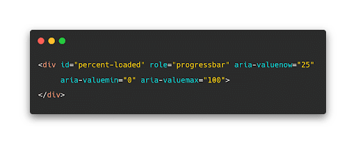
For an example of using ARIA roles to enhance accessibility, let’s examine the standard Salesforce Lightning Design System Progress Bar:
The bar is visually clear for sighted users, but adding ARIA attributes to describe the role and value of the progress bar make the component much more accessible for users who cannot rely on sight.
Styling and CSS
Writing proper markup is important for accessibility, but so is the visual design of the experiences we create. A common accessibility issue across the web is contrast, or a lack of it. Thankfully, contrast problems are fairly easy to solve with the help of a tool like WebAIM’s contrast checker.
The harder problem is ensuring that the design and intent of the content on the webpage is logical and clear for all users. Default browser styles do a good job about making the intent of standard elements clear. For example, an anchor tag uses a blue color and an underline to make itself visually distinct from standard paragraph text, while headings are typically bolder and larger.
We don’t need to adhere to the standard browser styles as we make our own designs and components, but it is important to keep the intent of our custom components clear in the same fashion. Does this element look and behave as expected? Is information laid out in a logical manner? From a visual standpoint, it should be clear what all the front-end elements do without the user needing to interact with them.
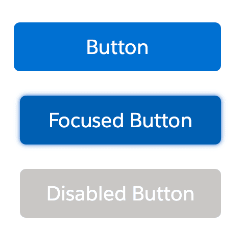
You also want to ensure you communicate visual changes in the state of what you are building. This is especially important in forms and interactive elements. For example, consider Salesforce’s approach to styling their standard button element based on its state:
There are separate designs for the button depending on if the user has focused the button or if it is disabled entirely.
Checking your accessibility work
Ensuring that we’ve built accessible sites can feel overwhelming, but here are some quick tips to help make it more manageable:
- Use your dev tools to perform an automatic accessibility check: both Chrome and Firefox have handy accessibility tools that can check for common problems (like contrast, missing ARIA attributes, and more) across your website
- Conduct an “accessibility audit” of your work: Try to navigate your site using a keyboard only. Or take it a step further and ensure that it is navigable via screen reader.
- Add accessibility testing with sa11y: sa11y is a set of JavaScript libraries that help developers write automated accessibility tests on the Salesforce platform. Sa11y can help check for common accessibility issues as well as any future changes that may impact accessibility.
- Reference the Web Content Accessibility Guidelines: These guidelines are the go-to textbook for making content more accessible. They describe interactions, scenarios, design principles, and more.
There are an overwhelming number of accessibility guidelines and requirements for developers to keep track of. Remember to give yourself a break and that it’s okay not to meet every single requirement all of the time. Just keep shifting into an accessibility mindset and doing what you can to build accessible experiences with best practices. This approach will go a long way toward making your products and services more usable by everyone.
How Silverline can help with accessibility
Silverline creates rewarding experiences for our team, our clients, and the world we live in. Those experiences are always anchored by accessibility. Our Silverline team of developers and designers has expertise with accessibility. They know how to integrate accessibility into our clients’ strategic planning and implementation to enable continuous value with the Salesforce platform. Find out how we can help your organization.


