Reading Time: 4 minutes
Today’s financial professionals are busier than ever.
But you have access to a set of AI-powered tools that help your teams become more efficient and empowered. Centralizing your data can be a game-changer for your business, and Tableau CRM for Financial Services helps your employees identify the right opportunities to engage their customers.
Whether you’re new to using analytics like Tableau CRM or want to make your dashboards more customized to your business, there are five important best practices to keep in mind.
How to build customized Tableau CRM dashboards
That’s exactly what we talked about for the third part in our three-part series on everything Tableau CRM. I sat down with my Silverline colleagues JP Owens, Sr. Director of Banking and Lending, and Jill Harrison, Managing Director of Silverline Ventures, to talk through our best practices for customizing your Tableau CRM dashboards.
Want to watch the entire webinar? Take a peek at the recording here.
Keep all of your layouts similar
You want your team to know where to find the information they need quickly. We always recommend our clients keep their layouts relatively similar throughout your different dashboards.
Often, that’s having a high-level summary at the top with filters to customize the details (we’ll talk about this in a minute), with your most important charts at the top, and making the dashboard more detailed as you go further down.

The goal of any dashboard is that it’s used. Whether you’re providing a snapshot of the opportunity pipeline and financial account growth or an overview of your top-performing accounts, you want your team to use the data you’re providing, and making the dashboards consistent is the first step.
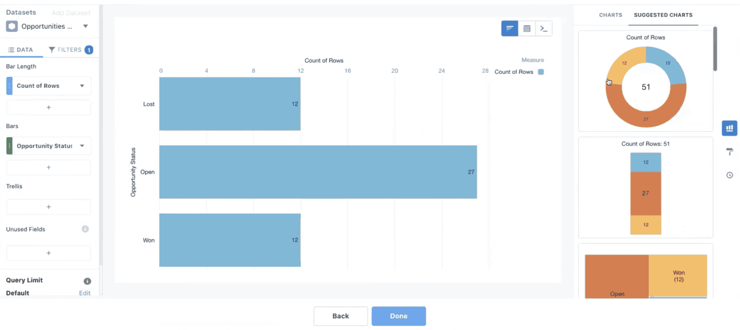
Match the chart types to the important information
Building a dashboard is just as much an art as it is a data science.
Your dashboards should tell a data story, not just deliver stats one after another. Any dashboard you build should lead toward a decision tree for the user — if I’m seeing X go down, I should do Y — so use different chart types to your advantage.
For example:
- Compare product lines to each other using a bar chart or column chart
- Visualize market share or account penetration using donut or pie charts
- Show the entire pipeline through multiple stages
Salesforce provides multiple ways to visualize any given piece of data — and with so many chart types to choose from, it’s up to you to match the right chart type with the story you’re hoping to tell with that kind of data.
Build and test with mobile in mind
One of the biggest mistakes our clients see? Not thinking about mobile when it comes to their dashboards.
Your team is incredibly busy, so chances are they’re going to be logging in to their Salesforce app on mobile, including your dashboards. As you build and test your dashboards, include mobile with that.
But it’s more than just making sure it works. You want to make sure it’s readable and scannable, with a layout that easily transports over to mobile. If your team needs to do a quick gut-check in a client meeting or wants to get started for the day with an overview of their accounts on their morning train ride, they can.
Use the embed and sharing feature for seamless workflow
If you’re already logging into Salesforce every day as part of Financial Services Cloud, then why make it harder to get the data you need?
After you build the dashboard, you want to make sure your team knows how to use it. There’s no need to make it harder for your team. Think about your team’s entire workflow and where data fits into that picture. Tableau CRM’s embedding and sharing features make it easy to get the right data in the hands of the right people on your team at the right time.
For example, you can embed account lifetime history analytics into the Salesforce account page, so the next time your team takes a meeting with someone from that account, they know everything they need to know without ever leaving Salesforce.
Include change management in the process
The best part about Tableau CRM dashboards is that anyone can use them, even if your team doesn’t have a degree in data science.
But that doesn’t mean your team is going to be immediately ready to go. Including education and group learning around the dashboards you create is critical. A lot of people may not have an intuitive understanding of how to read and interpret data, and you want to make sure they feel comfortable and confident with what they’re seeing.
You want your dashboards to be a part of the decision-making process for your entire team — and for that to happen, your team needs to use them. Whenever you launch a new dashboard, you need to educate your team on how to interpret it and why it matters to them.
Set clear expectations with your team on what each dashboard can and can’t do, and how your dashboards mesh with the rest of Salesforce’s features.
Tableau CRM and Financial Services Cloud
Silverline is here to help you implement an AI-powered solution like Tableau CRM, enabling your financial services professionals to handle their hefty workloads. With growing client lists and increased expectations for personalized service, bankers and wealth advisors need to know where to focus. Learn how Tableau CRM for Financial Services can help your employees identify the right opportunities to engage their customers, and how centralizing your data can transform your business. See how Silverline can help.