Reading Time: 4 minutes
In his classic book, The Design of Everyday Things, Donald Norman, director of The Design Lab at the University of California, San Diego, presents the argument that any failed user experience is the fault of bad design, not the fault of the user.
There was a time when I agreed with Donald Norman’s theory of user error = bad design. But that was before I owned a front-loading washing machine.
Context is key in user experience
There are times when user error has less to do with the product in question and much more to do with the contextual experience — or mental model — a user brings to that product.
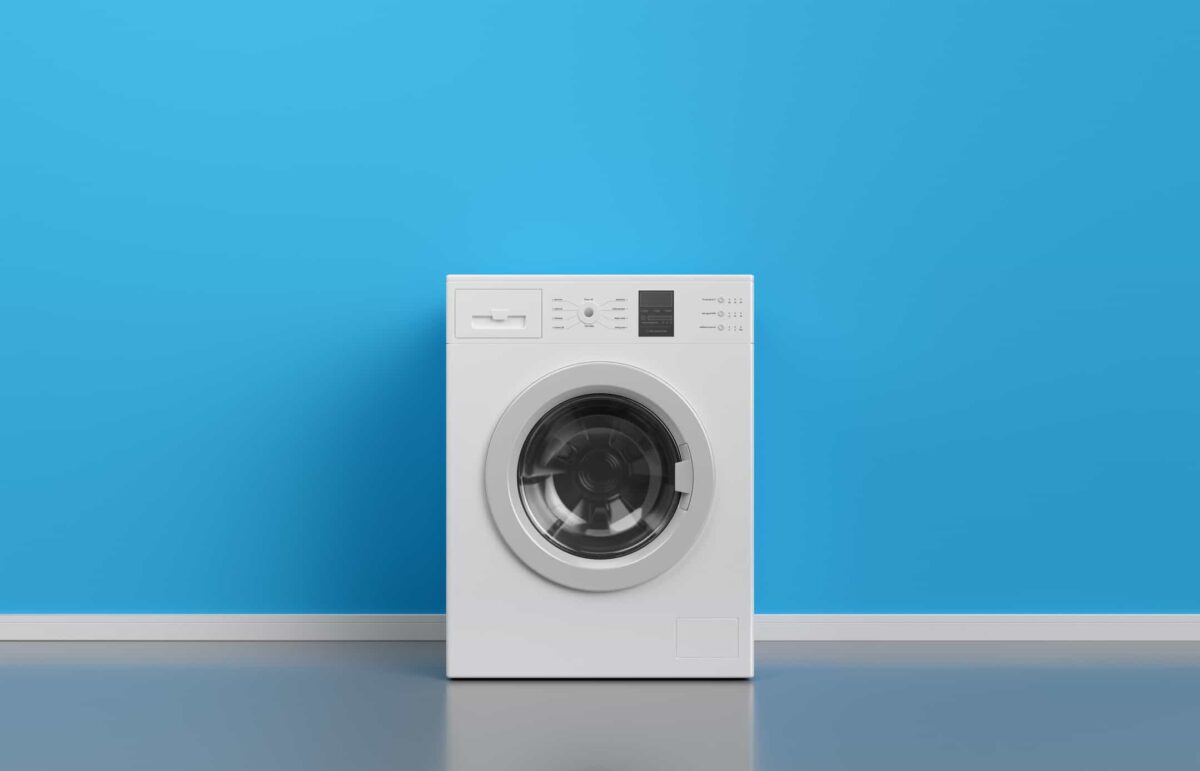
When Maytag introduced the first consumer front-loading washing machines, my wife and I were early adopters. The first generation of these washing machines were plagued with problems involving the rubber door seal. Designed without proper ventilation, this seal was the perfect place for growing black mold. The problem became so bad, Maytag actually created a retrofit kit with a new seal that had supposedly been re-engineered to solve it.
My mental model for a washing machine is one in which I should be able to set it in a corner and forget about it. The only attention it should ever need is when I decide to move it to a new location or replace it.
We had our washer retrofitted and it helped, but did not solve the problem. We learned to live with our mold problem and when it came time to replace it, we went and bought another one. A different brand this time, an LG, and we bought it with the expectation that after 15+ years of iteration on the design our mold problem would have been solved. Unfortunately, it had not.
Hidden in plain sight
I decided I would solve the mold problem since Maytag and LG were unable. I did some research. I found a little device called a “Laundry Lasso,” which held the washing machine door open slightly — just enough air circulation to keep mold from growing. It worked! After so many years, problem solved!
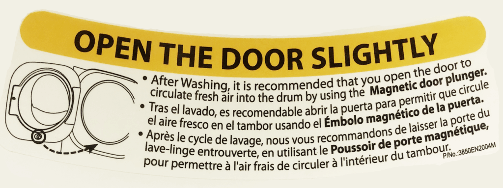
And then one day, I bent down to add a load of darks and noticed for the very first time the following label located on the inner rim of the machine:

This label, easy to read and understand and placed to be noticed quickly tells me everything I need to do to keep my washing machine mold and mildew free. There’s even a “magnetic plunger” built into the door, designed to keep it slightly open.
Favoring familiarity over function
So how is it possible that as a user I missed absolutely everything about this?
There is clear, prominent, and strategically located user messaging. I have a comprehensive user manual available both in print and online. Short of flashing lights and sirens, what more do I expect LG should do for me regarding this issue? The problem is no longer LG’s. The problem is mine: the mental model and experiential context I bring to the product.
Cost, benefit, and trust
As an early adopter of Maytag’s front-loading washing machine, I chose to learn to live with the door-seal problem because the overall benefits of a “better” way to wash clothes outweighed it.
UX research shows that the more one has invested in a product the more willingness one will have to accommodate its shortcomings.
I had accepted a cost/benefit/trust paradigm that would define the context of my user experience with front-loading washing machines for almost two decades. This context of trust with Maytag was so powerful that I proceeded to transfer it to LG and continued to live with a problem that LG had effectively solved years earlier, and to which I was literally blind, despite a big orange label.
User experience in the Salesforce ecosystem
At Silverline, we take the sheer weight of the cost/benefit/trust paradigm very seriously. Standing up a Salesforce Org is a big deal in time and resources for a customer. According to Ruby Newell-Legner, it takes 12 positive customer experiences to make up for one unresolved negative customer experience. In this context, as in my experience with front-loading washing machines, Donald Norman’s “user error = bad design” theory becomes irrelevant. Both just equal bad.
As a Silverline Consultant and UX Designer practicing Experience Design within the Salesforce ecosystem, when our customers show us how they do their work there can be no judgment. Our customers bring us thousands of unique contextual experiences which inform what we design and ultimately build for them. My challenge as a designer is to design elegant user experiences which map to this context.
When our customers show us how they do their work there can be no judgment.
What makes Salesforce Lightning Design System (SLDS) so powerful as a Design System is that every pattern and control — from the smallest icon, to the most sophisticated component — has been exhaustively researched and tested by real users. What this means is that when Silverline stands up a Salesforce environment, our expertise with SLDS allows us to match the mental model a client has for how they expect their solution to work with the solution itself.
Using SLDS to design user experiences means we have a much better chance of avoiding the possibility of moldy door seals in the first place. And no need for a bright orange sticker on the door in an attempt to make it right.
Interested in seeing how your org can improve its user experience? Contact us.


